Listen everywhere to The Doing Good Lab through your favorite podcasting application or wherever you get your podcasts.


Share:
If you want to elevate your donation form and create a smoother, more engaging giving experience, then you’ve come to the right place. In this episode of The Doing Good Lab, the Digizent team explores practical, high-impact enhancements that can help nonprofits boost donor confidence, strengthen trust, and increase generosity.
Join Aaron Sandoval, Rebecca Vanderwerf, and Rogelio Bazán as they share the thoughtful strategies behind effective, mission-aligned donation forms. As you listen, they’ll walk you through what makes a donation form clear, intuitive, and emotionally connected to the rest of the digital fundraising campaign — and how even small adjustments can create meaningful lifts in donor response. Whether you’re refining a long-standing form or creating something new, these insights will help you build a donation experience that reflects your mission and honors your donors’ intent to give.
Plus, you’ll hear more about FlexFormz, a donation platform designed to help nonprofit organizations optimize the giving experience. We have seen organizations increase their donations anywhere from 10% — all the way to 80%.
Aaron Sandoval – Digizent Chief Creative Officer:
Aaron is an award-winning authority, speaker, and industry leader on interactive strategy, architecture, user experience, and creativity. He has crafted interactive media for dozens of partners such as SONY Music, Coca-Cola, PayPal, Susan G. Komen, Network for Good, and has worked for scores of international enterprises.
Rebecca Vanderwerf – Digizent President:
Rebecca, a founding principal of Digizent, provides senior leadership to the technical, creative, and project management teams in our Puebla, Mexico office. She is an expert in managing the development of websites, landing pages, eAppeals, and forms. Becky consistently provides world-class solutions for clients with digital needs and challenges. A graduate of the LA Film Center, she is also the producer of award-winning videos and motion graphics for Digizent clients.
Rogelio “Ro” Bazán – Director of Technical Development:
Ro is a fundraising–focused technologist with 11 years of experience helping nonprofits elevate their donor experience through thoughtful UX and scalable digital tools. As one of the original creators of FlexFormz, he has worked closely with dozens of organizations to streamline online giving, optimize recurring revenue, and solve complex data and payment challenges. His passion lies in designing user-centered donation experiences that not only simplify giving but also meaningfully support the mission of every nonprofit he serves.
FREE Donation Form Analysis:
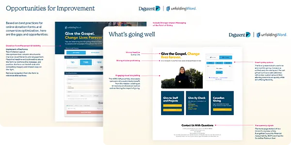
Looking to enhance your online giving experience? Digizent is offering a free donation form analysis to help nonprofits identify opportunities to simplify the donor journey, strengthen clarity, and increase conversions. Our experts will review your donation form’s design, messaging, and technical performance — then provide actionable recommendations tailored to your organization’s goals. Request your free analysis now »
Digizent | Doing good.™
At Digizent, we create strategic, creative, and technical digital solutions that are award-winning, dynamic, and purpose-built for your nonprofit’s success. We believe results reach far beyond clicks and conversions. They touch lives, build futures, and shape a better world. That’s Doing good.™
Paola Espinosa:
Welcome to the Doing Good Laugh podcast brought to you by Digizent. This is where we dive into strategies and ideas to help nonprofits thrive in a digital world. I am your host, Paola, and today we are talking about a topic that’s often overlooked but incredibly important. Your donation page. It’s one of the last steps in your donor’s journey and if it doesn’t work well, it could cost you the gift. That that’s why we want to talk today about optimizing your donation forms. As fundraisers ourselves, we understand the critical role donation forms play in capturing support. That’s why we helped develop FlexFormz, a platform designed to help organizations like yours optimize the giving experience. Built for ease and flexibility, FlexFormz lets you embed mobile friendly donation forms anywhere on your site without reddecting visitors, making it easier for donors to complete their gift. Today, I’m excited to be joined by three amazing Digizent leaders, Aaron Sandoval, our Chief Creative Officer, Rebecca Vanderwerf, President of digicent, and Ro Bazán, Director of Technical development and the technical mind behind much of our FlexFormz’ platform. Rebecca. Ro, welcome. We would love for you to introduce yourselves. Please tell us a bit about what you do and what excites you about this topic.
Rebecca Vanderwerf:
Thank you. Pao . It’s great to be here today with you all. I’m Rebecca Vanderwerf. I’m president of Digizent. I have been working with Digizent for more than 15 years and I’ve had the honor and the privilege of serving nonprofits for those 15 years. We love donation forms. We love helping drive response for nonprofits, helping them increase their revenue so that they are able to do more good in this world. So we’re really excited to talk about this topic today. Thank you.
Paola Espinosa:
Thank you, Rebecca. Ro, what about you?
Rogelio Bazán:
Hi Pao. Thank you for having me. My name is Rogelio Bazán, I’m director of Technical development and I’ve been with Digizent for more than 11 years already. I’ve been working with nonprofits for these 11 years and I have worked with tons, tons of different donation platforms and that’s why we decided to create our own. We have a lot of experience fixing those donations platforms. So we thought like, we can do better. We can, we can make this easier for the donors and better for the organization. So that’s why we decided to jump in this challenge to build FlexFormz. Right. I’m very passionate about fundraising and the user experience that is behind it. So yeah, I love to talk about.
Aaron Sandoval:
This I’m really glad I get to share today with Rogelio and Rebecca. You know, I call them Becky and Ro. You know, that’s around here on this podcast. Becky and Ro. I’ve known them both for a long time. I’m not going to say how long to not age myself too much, but I’ve known them for a long time. And one of the things that I love about hanging out with the two of you is that you bring your own area of focus. Right? Ro, you and your team are thinking development. You’re thinking the technology side. Becky, you’re thinking the strategy side. How do we communicate correctly? What’s the best way to connect with donors? I come from the design side. Right. I love the aesthetics of it, the usability of it, the UX of it. But the three of us, we really bring the perspective of we’re fundraisers. Right? The rest are tools. We love to use the tools, but we bring our fundraiser hat to this conversation, and I think that’s what really helps the platform work well. And that’s the approach to donation forms. That’s kind of our philosophy as we look at how donation forms works.
Rebecca Vanderwerf:
Absolutely. Aaron. I always say this is a product not built by developers or not built by product, by a product team. This is a product built by fundraisers. We are fundraisers, first and foremost, product developers second.
Aaron Sandoval:
Yeah. And, you know, at the end of the day, the donation form, where you arrive, it’s kind of where the campaign, everything you’ve built leading to it is won or lost. You know, I think of imagine a dining experience where you see all these ads for a nice, juicy hamburger, right? And, man, all week long, you’re thinking, it’s Friday evening, I really want to go get a hamburger. And you walk into a place, and it turns out all they have is fried chicken. And it just feels like a different experience. You’re like, this isn’t what I thought it would be. And so many times we create that experience, sometimes inadvertently, because we ignore that last step. Right? We ignore the architecture of the donation form. You know, you want it to feel inviting, focused, mission aligned. But sometimes we just drop the ball at that point. And that’s why, you know, a great donation form doesn’t just work because you build it and it’s there. It really needs to carry the story, the emotion, the momentum of the campaign. In many ways, if you think usability needs to get out of the way in some points and just let the donor continue their donor journey. So that’s really our perspective that’s how we approach creating a donation form.
Rebecca Vanderwerf:
Absolutely. I would say the best donation form is the one where you least notice all of the very elegant work that’s going on behind the scene, because it truly gets out of the way. And that donation form is where that donor moves from their intention to give to the actual action to give. And so my primary philosophy in a donation form is get out of the donor’s way. They came to give, and so don’t make them make a million choices before they click that give now button. They’re already there to support your organization. And so if you make that experience unclear, clunky, slow, with way too many elements, that’s when we lose donors because it’s not worth their time to have to go through all of these steps. And so truly, I believe that how you present your donation page is a reflection of that, of the fact that you truly care about that donor’s experience. You want them to have a good experience. It’s not about what I, as the organization want to receive from that donor. It’s about caring about their experience on your page. And so when you truly have a well designed form, you’re honoring that donor’s time and that donor’s trust in your organization.
Aaron Sandoval:
And we’ve talked about that concept of honoring the donor in previous episodes of this podcast. That’s such an important piece of this whole process.
Rogelio Bazán:
And yeah, just complementing what you said, Becky. One of the most important rules on the UX is don’t make me think, right? So in a donation form, this rule needs to be like, very precise and very well thought because it’s a very sensitive part in the donor’s journey. Right. It’s where they finish the process of the donation. So we need to remove all the friction that is on that form to make the better feel comfortable that they can understand and support their mission without any bumps in the road. Right? So here’s where the tech and a donation form needs to complement the whole story and the whole project behind a campaign. Right?
Paola Espinosa:
That is so true. And let’s talk about what gets in the way. I know we’ve mentioned some things already, but. But what are the most common donation page mistakes?
Rogelio Bazán:
I think the first and foremost, you need to reduce the fields that are on the form. So the less fields that a donor needs to fill in, the process is going to be better. You don’t need to ask them all the questions that you want in a single form. You need to be like, very straightforward and literally guide them and take them by the hand and just following like few steps at most to fulfill that donation. Right. So you need to remove all the fields that are not needed or required on a process for a donation.
Aaron Sandoval:
So like you don’t need to ask for like their home phone number or their second cell number or you know, you really need to stick through to what are the most necessary fields, what do you need for the transaction to. You can always build the relationship later but what do you need for that transaction to happen? Because every question is a friction point and you want to reduce that for sure.
Rogelio Bazán:
So I think the most insight fields are obviously the name of the donor, an email so we can relate to all the CRMs out there and the recipient process. Of course you want to get the address in case you want to send them a physical receipt to their homes. I think that’s it. The most desired fields are the first name and last name, like first name, last name, email and physical address. I will not add any more unnecesary fields. I think also the second one is support. UX spins that the form is not very good at mobile. We’re moving into a new era where the users tend to visit more your site through the mobile devices.
Aaron Sandoval:
Oh yeah.
Rogelio Bazán:
So if your forms are not prepared to be responsive and work well in mobile, you are losing tons of money just by not getting a good user experience for mobile devices. This is a trend, this is the new reality. So if a form is old and not really good for a nice experience, it’s going to affect a lot of the completion rate on it. And you need to be very clear about errors and confirmations. So the donor needs to feel right away that they are missing some field if they are getting some mistake on the form. And of course they need to have a quickly confirmation that the donation was processed right away. Yeah, because that tends to be like a very sensitive point. If your forms doesn’t show like the transaction was processed or was successful, it tends to create doubts on the donor, right?
Rebecca Vanderwerf:
Absolutely.
Rogelio Bazán:
So it creates neurotism on the donor so it will start to ask the donation went through did I need to donate again? They are stealing my money in some aspects. Tell careful with the confirmation. And even if though if there’s an error on the transaction, you need to be very clear of that error like donation didn’t went through so the donor can feel very sure that that donation.
Rebecca Vanderwerf:
Do I need to click multiple times on that submit button to make my donation go through? And talking about that submit button, submit itself is not very inspiring and so make sure that whatever that button is to complete their donation or to even make an initial donation is very clear. We don’t like generic CTAs. If I’ve just read an incredible story about impact that’s happening all around the world, or I’ve seen a very compelling ad, that CTA needs to match that emotional tone. So it can’t just be. Submit or donate. It’s much better if it’s give hope now, send a bible now. And we’re in the digital world, so we always want to use that immediate language of now versus today. And so anytime you’re in the digital realm, try using all of your language around now. Because digital is almost always an immediate action, but busy layouts, you know, a lot of times we want to get everything possible on that donation page. And it’s, it’s almost like we’re screaming for the donor’s attention all over the page instead of focusing on that clear, simple action that we want them to take. Keep it simple. Simplicity drives that action. One clear example are just button amounts. You know, so many, so many times I’ve seen donation forms where they have six, eight different button amounts. Honestly, we live in a world today where choices abound every second of our lives. And when you add one more choice to the donor, it creates friction. And so in our testing over and over again, we have seen that three buttons is going to outperform more buttons, you know, more than three buttons practically every single time. You don’t have to have every possible gift array option out there. Stick to three buttons or stick to no buttons at all for your major donors or your higher givers. Don’t lead them to a smaller donation. You know, lead, lead with a, with a blank other field for them to choose their own amount. That can also perform very well.
Aaron Sandoval:
It’s interesting, Becky, to note that more choices usually lead to people not making any choice and then abandoning. Right. And so the more that you can simplify, like you said, the three buttons, that’s fantastic.
Rebecca Vanderwerf:
Yeah, absolutely. And then missing that monthly opportunity, you know, sometimes you have to ask a few times or, you know, even just call that out multiple times that monthly gifts really do drive the support of the organization and so on. FlexFormz, for example, you know, we have that initial, do you want to give once? Do you want to give monthly? But then we have additional call outs. You can, you can add that that are in the middle of the form that says, hey, monthly giving really would help us. And I always love those kind of. We call them monthly reinforcers. Because many times you may just have not gotten the monthly gift because they didn’t see it at the beginning of the form. And so adding a second place halfway through, where we can continue to encourage that month, that monthly giving can really help drive monthly support, which is obviously the lifeline of every nonprofit organization.
Aaron Sandoval:
Yeah! You know, one of my pet peeves we were talking about buttons a second ago is, let’s say in an email or a landing page, you’ve been making this case for a very special project. Right. $125 sends five kids to summer camp where they can learn great life skills or something along the lines. Right. And you get somebody excited about, well, I want to help these kids. It really. Is it only $125. I can absolutely give that. And yeah, I’m going to click through and suddenly the donation form says, what do you want to give? 25, 50 or 75? And you know, that doesn’t match. And so the person is forced to try and make those things align. And, well, do I. How do I make it be the125 I want to do? And so be consistent in that. In that place. If you’re talking about a gift array, you help one person, three family, three families, five families, carry those numbers, carry that math over to the donation form so that somebody who’s made a choice gets there and they know exactly what they want to choose and give to. At the end of the day, I think what happens is we start treating the donation page like just a transaction. Right? It’s just the. The place where they have to enter the basic. Their information and really don’t care about the experience. It’s just the donation is over the moment they chose to arrive there. But that’s not the case. When you think from a donor’s perspective, that’s just the next step in the journey. Which includes the thanking them, right? The confirmation, like you mentioned earlier, Ro. The thanking them, the reporting on what happened with their gift. But the form is all part of that, too. It’s not just stepping out of the lane of the story, it’s the part of the continuation of that donation journey. So don’t think of the form as cold and. And impersonal. Don’t think of it as just, well, this is where the tech team gets involved and the story dies there. No, no, no. It needs to continue. And that’s why I love what the FlexFormz team has done, because they bring that heart of the donor through the whole journey. They’re thinking of that and they’re helping you do that as well. So what do we do? How do we fix these things? Right? You know, we can point out issues all day long. How do we help somebody fix their forms? I know Ro, you guys have a lot of good ideas and we’ve talked about them in the past, we’ve worked together. But I think we all would agree that simplifying, and we’ve been talking about this a little bit right now, simplifying is one of the first things that you can do quickly, right? Look through your form. What fields am I asking for that I don’t need to be asking for? This morning I was donating to a friend of mine. He’s going to become a missionary in Peru and I was trying to fill out a donation form and the amount of steps and pages I had to go through, it was. Are you sure you want to do this? Now add this to the cart. Now go to the cart. Now create an account. Now.
Rebecca Vanderwerf:
Are you really sure? Are you really sure you want to support your friend?
Aaron Sandoval:
Are you sure you want to help? Because maybe you’re not so nice, you know, maybe you want to walk away from it. So start by simplifying. Can you get it into one screen? Can you get it into just the absolute basic forms? Can you not have somebody do a long drop down where they have to choose through a bunch of different options? Can you just make it as simple as possible. That’s one recommendation. Another is you were talking a little bit ago about the, the buttons, Becky. Suggested donation amounts. Right? Think about what your, what your average online donation is and start there. How can I build above and below that? How can I encourage people to start giving? Many times you get lower donations because you’re giving lower. Suggested giving them out. So think through what is going to be the ideal situation and then make sure you’re tying it to tangible outcomes. Right. The form I was looking at this morning said 25, 50, 100. Well, that didn’t help me know. Well, what good does that do, right? So when you think about a button, imagine something that would say something like $100 equals water for one family. Well, now I know that if I want to help two families, it’s 200 or, or. There’s an aspect of this that tells me this button correlates to the benefit that I want to help with. Right? It unifies the story. It, it really in many ways is a continuation of the campaign. It’s not just a button. It’s a continuation of the story of a narrative you’ve been building. And so, that’s a great way. Think about simplifying, thinking about how to carry it out through details, even like the buttons. Ro, what are some ways that you would love to tackle some of these ways to fix donation forms from your perspective?
Rogelio Bazán:
I think you mentioned something very important. There’s some mistakes where we try to compare sometimes the donors with a customer that is buying something online. And there’s a very big difference between donation and donors and customers. Right. Because a customer might buy a product one time, but you need to build a relationship with that donor to trust them to create a long lasting relationship where they can support your mission. And, and the form is the door to open that relationship. Right. So you need to create a form that can create that confidence, that whole experience that they can trust you and they can trust in your vision.
Aaron Sandoval:
That’s absolute gold. If anybody’s listening to this, that’s all you heard. That was it. Just write that down. That is gold right there.
Rogelio Bazán:
That’s why we built FlexFormz. We want it to be like the open door for your donors to create this relationship. So we build these forms with the mobile experience first because we know the mobile is the first thing where the donors will land on your forms. And we need to make it very simple, make it very understandable. We need to reinforce the trust that the process is a secure process. We need to give real time feedback, as I mentioned. But yeah, I think mostly that’s it. So removing all the fields that you don’t need, you can also rely on the express checkout versions that are available like Donate with Apple Pay, Donate with Google Pay. Just with a click of a button you can create the whole experience without need to film anything on the form. It’s just a click.
Aaron Sandoval:
Which by the way comes standard in all FlexFormz. Just, you know, throwing that out there.
Rogelio Bazán:
Yeah, it is. We support Apple Pay, Google Pay. But yeah, simplify the experience for the donor when you can create that relationship. It’s what you need to face mainly In your forms.
Rebecca Vanderwerf:
I would say. One important aspect is to make sure that that donation page visually matches your campaign assets.
Aaron Sandoval:
Yeah.
Rebecca Vanderwerf:
So again, if that donor comes from that compelling email ad, when they arrive at the donation page, it needs to have a same, that same photo that inspired them in the first place, the same tone, the same message, so that they do feel like they’re a part of that continuation of the story. As Aaron was talking about. Imagery is so key. And I see, you know, almost every day I see a donation form that doesn’t even include an image like, giving is emotional. They need to see people on that page. People give to people. People don’t give to organizations. They give to people. Having a good headline at the top of that donation form, the headline needs to deliver on the promise from that call to action and so making sure it’s very direct and it’s very clear on the support and the help that is needed for that campaign. Also, don’t be afraid of white space. Keep that layout clean. White space isn’t “Oh, they were missing some content here and they didn’t know how to fill out this design.” It’s strategic because it’s helping the donor focus on what’s important. It’s helping the donor feel calmed and not overwhelmed by so many different aspects on the page. One thing we always love doing on single page donation forms is removing that primary primary navigation. Because by the time they clicked donate and they arrived to that donate page, we don’t want them to go to other pages. We don’t want them to go, let’s not have them wander. Don’t go to the about and read more, more about the organization. If you’ve already clicked donate, let’s take that off and let’s keep them on the page focused with what they’re supposed to be doing.
Paola Espinosa:
So, Becky, what are some of the real wins and lessons that we’ve learned over these years?
Rebecca Vanderwerf:
Well, honestly, Pao, we really see impact and donations go up when they’re optimized with intention. You know, we have seen organizations increase anywhere from 10% all the way to 80% when they’ve switched to FlexFormz. Because we’re designing and we’re building with intention. And so that donor experience was cleaner, it was faster, and it was more emotionally aligned with the campaign. When you need to create another donation form with FlexFormz, it doesn’t take hours. You know, you can literally click a duplicate button on FlexFormz that will create a new one within one minute. And then you just update that campaign creative, those assets to make it align with your campaign and you’re good to go. This is not hard to do, but when you’re intentional creating unique forms per campaign, you will see response rise. And honestly, just a bonus tip, gift catalogs make giving even more meaningful, especially this time of the year. As Aaron was saying, when you can tangibilize that donation amount with the impact that it’s going to have, that’s what a gift catalog does. You’re seeing different ways that you can make an impact within the org, different giving opportunities, different needs that exist all around the World and FlexFormz Gift Catalog makes that incredibly easy to set up. FlexFormz built the first ever gift catalog for nonprofit organization. I have yet to see any other gift catalog out there that even comes close to what FlexFormz can do. And it’s built for giving, it’s not built as a commercial card experience. And so it’s really, really, really powerful to use. And I mean we, we just set up one recently for a new org Ro you and I worked on setting one up. We got it live within a week because they wanted it ready for their direct mail piece that was about to mail out. And you know, their initial comment was this is, this is the best gift catalog we have ever had. They’ve in the past tried to use commercial cards or force other platforms to function in a gift catalog way and when they turned it over to FlexFormz, we got it up and live within a week. And it’s happily being used right now for all of this fun year end giving season.
Rogelio Bazán:
And I want to add that client moves everything to FlexFormz now.
Rebecca Vanderwerf:
Yes. After they saw the gift catalog.
Rogelio Bazán:
They ended up moving everything to us. Yeah, that’s one of the things that FlexFormz does well. Right. So you can test it and if you like it and if it’s working for your learnings and it’s working for your mission, you can move everything to us without a problem. Because you don’t have a fixed contract that have you died for a long period of time. You can test it and if it’s not working, you can go back to your previous donation form. If you like it, you can stay with us. It’s one of the great things about us. But yeah, we don’t have hidden fees, we don’t have monthly fees, we don’t have annual fees. So I’m pretty sure you will end up moving everything to us. That’s this period that we have with clients.
Aaron Sandoval:
Well, that’s really great. You know, when you think About FlexFormz, FlexFormz is built around respecting the donor’s journey. And that’s what we really have been talking about. Feel free to go and check out FlexFormz because I think it’ll help you as you simplify your donation forms, as you try to make buttons that are easier to use, as you think about language that’s clear, you think about some of the practical things like we talked about concise feedback, having the donor feel comfortable throughout that whole journey. Those are really practical ways that you can help make the donation form experience really be part of the journey. We really believe that as you take a look at this, as you think through the process, it will inspire you to think about how your donation form can be better and how it can help the donor feel more comfortable, feel more connected. So all these are important parts as we think about simplifying and making the donation form a better experience for your donors.
Paola Espinosa:
Thank you Aaron. This was such a helpful conversation. Whether your donation page needs a complete rebuild or just a few thoughtful tweaks today, insights are a great starting point. Remember, your donation page isn’t just a tool, it’s part of the story and when it’s done well, it invites people to become part of something bigger. If your donation form has been a source of frustration this year, or if your results haven’t matched the effort, strategy or heart you’ve put into your campaigns, we would really love to help. Even small issues, informed design, or user experience can affect donor response. We’re offering a free donation form analysis from our team at Digizent. You will walk away with practical insights you can use to create a smoother, more effective donor experience. Visit digizent.com/podcast to request yours. Thank you Aaron, Becky and Ro for sharing your wisdom and thank you for listening to the Doing Good Laugh podcast. We will see you next time. For more information and resources, please visit digizent.com/podcast
If this year’s results haven’t met expectations — or if your form has been a source of frustration — let’s take a look together. Request a FREE Donation Form Analysis from Digizent. No pressure — just honest, helpful feedback from a team of experts who know fundraising.
Don’t wait! Contact Digizent now to learn how our powerful combination of exceptional skillsets, service, and afforability may well make Digizent the best solution for all your digital needs.

We promise you'll hear back from us in 2 business days or less!