Logo

THE APPROACH
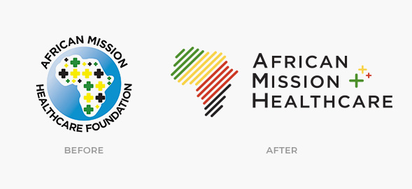
The challenge for the redesign of the African Mission Healthcare logo was to simplify the logo that the client was using and turn it into something that visually spoke about the objective of this organization. It was important to highlight the place and the mission, which is why we chose to use the map of Africa in an abstract fashion and use predominant colors in the flags of that continent’s countries.
In addition to the typographic arrangement, cross symbols were added to symbolize the organization’s support of Christian medical missionaries and mission hospitals that provide compassionate healthcare in several regions on the African continent.
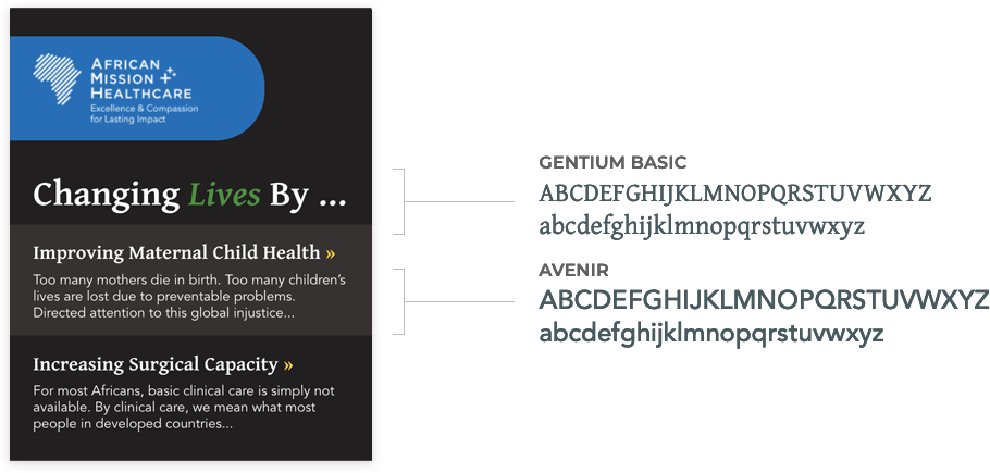
Fonts

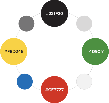
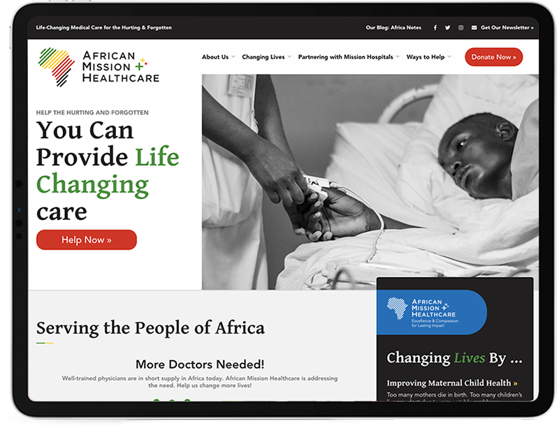
Colors and Other Applications


