Logo
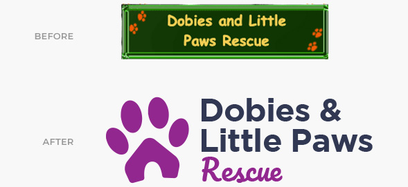
THE APPROACH
For this redesign, we were fortunate to have a lot of freedom in creating their new logo. Our purpose was not only to improve the aesthetics but also to create an icon that more effectively illustrated Dobies’ mission. For this reason, we used the universal form of a dog’s footprint, modifying it to resemble a house — which is a home for the rescued dogs.
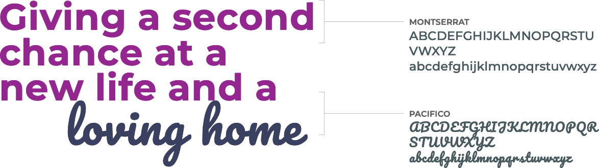
Through typography we wanted to highlight its accessibility and the humanism of the organization, combining san serif fonts with script (in purple).
Fonts
Colors and Other Applications