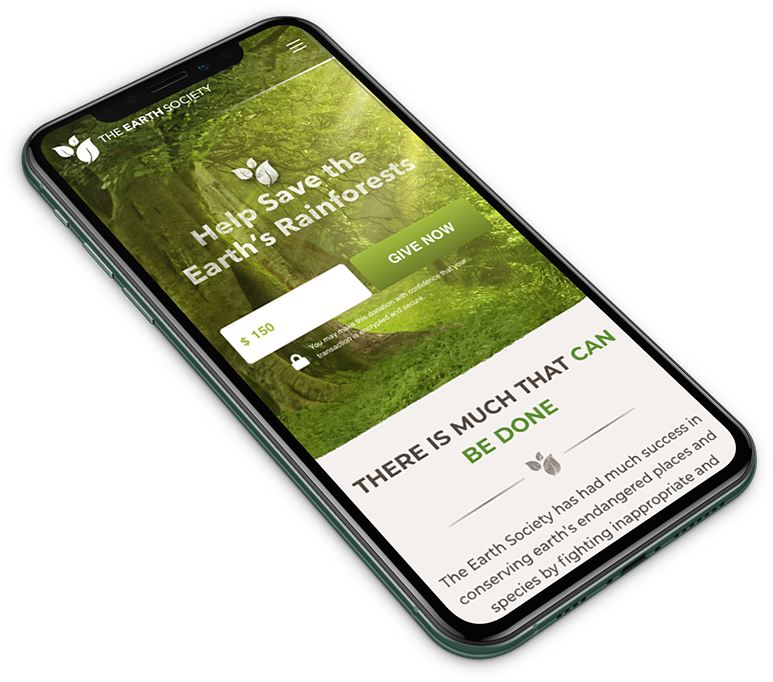
Logo
![2001 Digizent Portfolio Brand Tes Logo](https://digizent.com/wp-content/uploads/2020/01/2001-Digizent-Portfolio-Brand-TES-Logo.png)
THE APPROACH
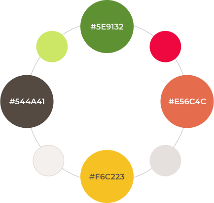
The Earth Society is a fictional organization created for taking care of our planet, intervening in 3 main areas: flora, fauna, and earth. What we did is represent these 3 areas with a leaf and a different color for each one, creating a playful icon that complemented the seriousness of the sans serif font picked for the brand. The color choice was really important for this logo since it needed to represent colors seen in natural landscapes, having the color green as the main protagonist, as nature does actually.
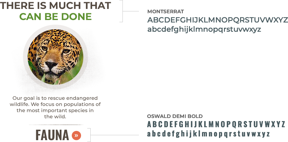
Fonts
![2001 Digizent Portfolio Brand Tes Fonts](https://digizent.com/wp-content/uploads/2020/01/2001-Digizent-Portfolio-Brand-TES-Fonts.png)
Colors and Other Applications
![2001 Digizent Portfolio Brand Tes Colors](https://digizent.com/wp-content/uploads/2020/01/2001-Digizent-Portfolio-Brand-TES-Colors.png)
![2001 Digizent Portfolio Brand Tes Mockup](https://digizent.com/wp-content/uploads/2020/01/2001-Digizent-Portfolio-Brand-TES-Mockup.png)
![2001 Digizent Portfolio Brand Tes Background](https://digizent.com/wp-content/uploads/2020/01/2001-Digizent-Portfolio-Brand-TES-Background.png)