Logo
THE APPROACH
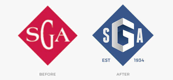
For the Slavic Gospel Association logo redesign, we started created several approaches but finally found the right solution in keeping the spirit of the logo. By modernizing it with perspective and volume; and changing the color palette to a less aggressive and more inviting color, we redefined the feeling of the logo and created a more approachable, human, dynamic and personalized solution to refresh their branding.
We also decided that adding the starting year of the organization will help us inform the viewers about the lasting and inexhaustible effort from SGA to help people in the Soviet Union through the Gospel.
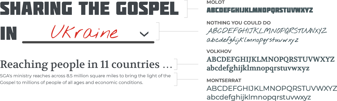
Fonts
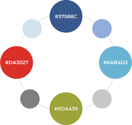
Colors and Other Applications