Logo

THE APPROACH
The balance between modernity and trust were key elements in the design of this logo. Szend is a product-focused on email delivery, so we needed the users to find themselves in front of a brand that transmits the values of technology and professionalism through their logo. The arrangement of the 3 green circles emits movement, innovation and a sense of growth. On the other half, the name arrangement, with a serif font in a dark gray color, transmits the serious and trustworthy side of the project.
Fonts

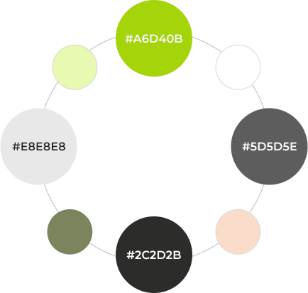
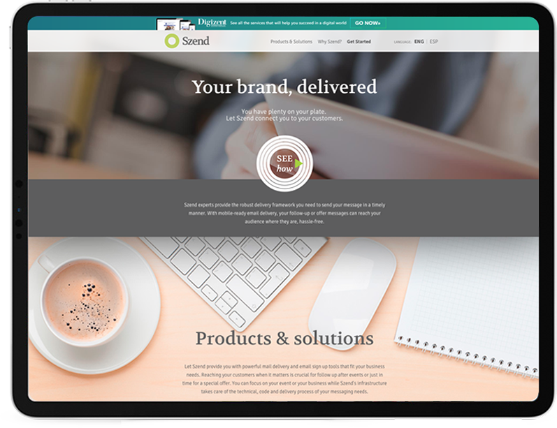
Colors and Other Applications


